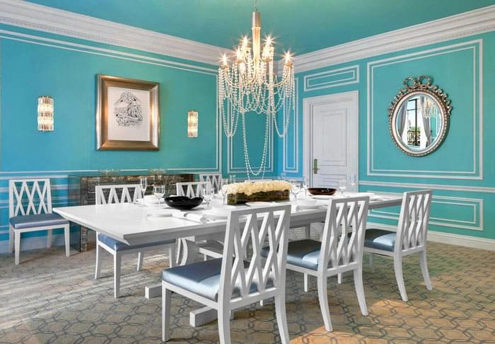
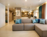
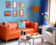
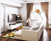
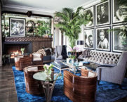
The charm of tiffany color: gentle, fresh and pleasant tones in the photo in the interior
If the gray-white-black tones of modern interiors do not touch your heart, then it needs a breath of a fresh and delicate shade, the color of youth and affection. The homemaster.techinfolux.com/en/ editorial team offers to consider the tiffany color in the interior, photos of which will give you a lot of positive emotions!
The content of the article
- 1 A bit of history: where the tiffany color came from
- 2 Tiffany color: pictures and descriptions of shades
- 3 Tiffany color code: what is its unique hex code number
- 4 How to get tiffany color in paints
- 5 What is the difference between tiffany and mint color: the answer of experts
- 6 What is tiffany color combined with: suitable tones
- 7 In which interiors the color of tiffany dominates
- 8 Tiffany color in the decoration and decor of different rooms
- 9 Tiffany color in furniture and textiles: set the accents
- 10 Video selection of turquoise interiors
A bit of history: where the tiffany color came from
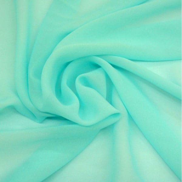
If you saw in the photo a pleasant mint color in milk with a touch of blue, but you do not know what color it is, then you admired the tiffany color.
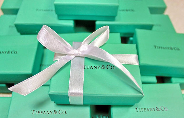
In 1837, the Tiffany company found an interesting little-demanded color that combined the features of gloss, sophistication and perfectly set off jewelry. And so it happened: all their products are sold in a branded box with a white ribbon.
But the founder's son went further and applied these shades in interior decor: he created amazing glass lamps that are still ready to decorate any interior today.
Tiffany color: pictures and descriptions of shades
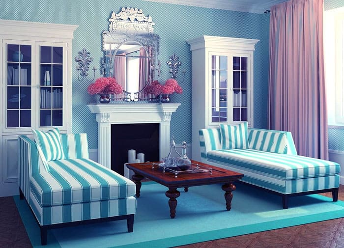
How would you describe the tones you saw yourself? Those who looked at it called the color elegant and at the same time fresh, light and aristocratic. It is perfectly combined in the interior with wood, metal elements: an exclusive decor in any direction is obtained.
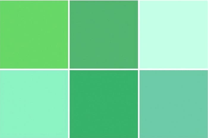
Some people still cannot determine whether this color is closer to blue or green. Well, this is a tricky question.It is better to see photo examples for yourself and draw conclusions. But designers describe it as a pale blue with a touch of green.
Tiffany color code: what is its unique hex code number
The copyright is reserved for the tiffany color under registration number PMS 1837.
If we take the hexadecimal code - hexadecimal triplet cod, there we will find the marking # OABAB5. It is between shades of blue, green and a touch of red. On the RGB (r, g, b) scale - 10, 186, 181, on the HSV (h, s, v) - 178, 95, 73.
How to get tiffany color in paints
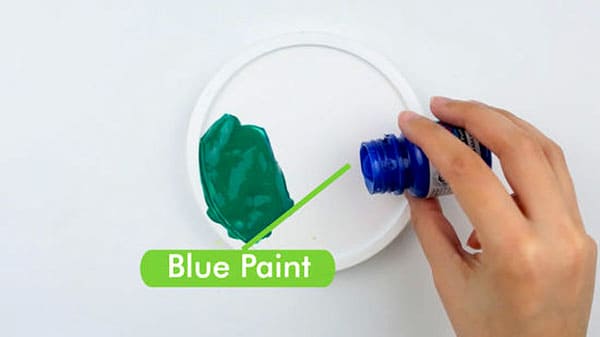
Despite copyright, use in palette such a beautiful shade is not prohibited. You can find exactly the tone that will make your interior perfect. To do this, you need to mix the base blue and green colors, but not in equal proportions: if you add a dumb white or light gray tone, you get a delicate paint. To acquire a rich shade that goes into turquoise, take green, blue and a little yellow: the tone is muted with white.
But for a true tiffany, only blue paint with green pigments is suitable: you can use cyan, ultramarine, azure or cobalt.
First, cyan and greens, obtained from a mixture of blue and yellow, are applied to the palette. Blue should be taken in 2 parts, and green from 0.5 to 1.5 parts. They take very little yellow.
Advice! Prepare the right amount of paint at once, next time the shade may be different!
What is the difference between tiffany and mint color: the answer of experts
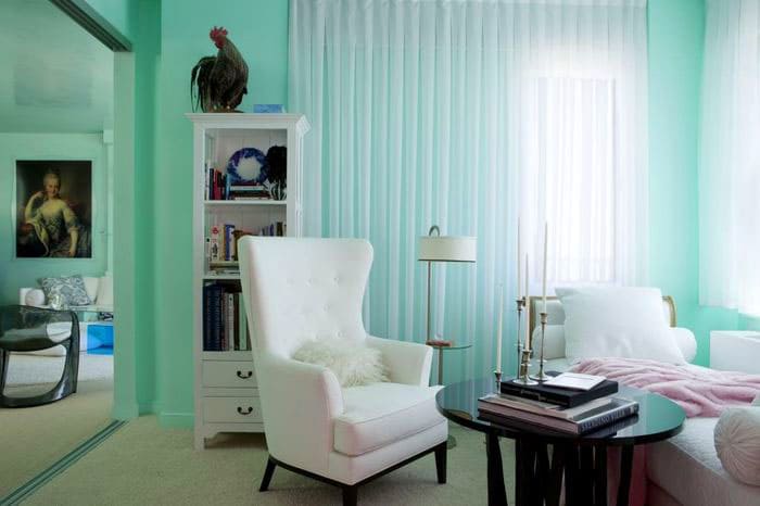
We can already describe tiffany in more detail: shades of heaven, fresh greens, even a little of the purest ice, everything is woven together. It is the perfect color for decoration.
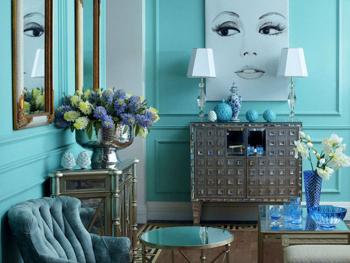
For some reason, it is easy to choose accessories and decor for such a color scheme.
PHOTO: design-homes.ru
Now let's compare it with the mint tone:
What is tiffany color combined with: suitable tones
The question of what colors the tiffany color is combined with is important for those who are designing their home or apartment. Experiments can end with the uniqueness of the interior look, do not be afraid to try!
What about white and pastel compatibility
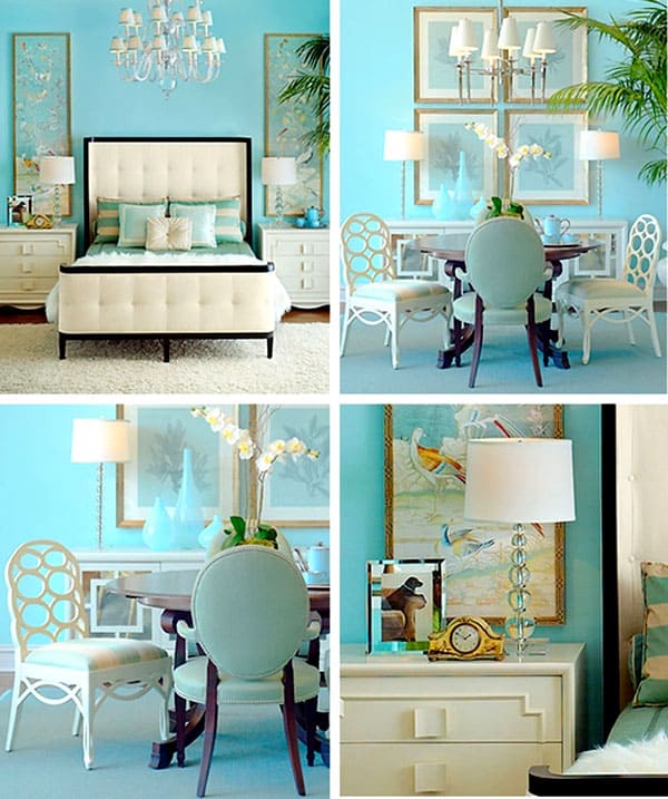
This is definitely a suitable tandem, all the colors will adequately complement and set off each other. It will make a wonderful background for sleeping space or for living room decor... White himself will become a kind of frame for such a delicate shade.
Subtleties of contrasting combinations with brown, black and green
To get contrasts, you need to boldly include rich tiffany tones in the design. As a couple, purple, black, brown and deep green will suit him.
In which interiors the color of tiffany dominates
We are going to dive into the study of suitable interior styles where tiffany shades can be implemented.
Mediterranean style
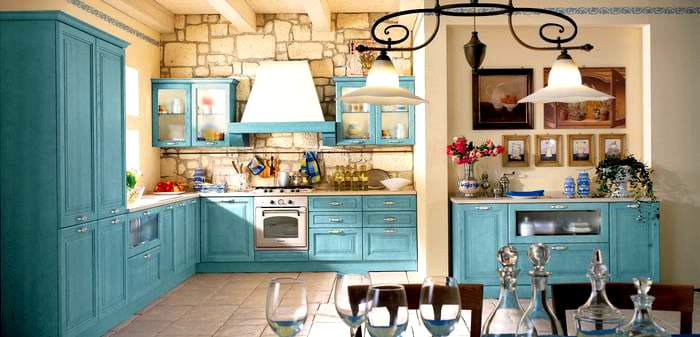
That's where tiffany's blue is more, it's the Mediterranean style. Simplicity of lines and natural marine colors, reminiscent of not only the sea, but also its coast with shells. To get a chic stylistic setting, wood and stones should be included in the interior. Tiffany will emphasize freshness, transforming the atmosphere in the room into a breath of gentle breeze.
A few more colors will be good partners: olive shades, blues, azure, terracotta and white.
Mediterranean decor suits terraces, bathrooms and kitchens.
Calm and soulful country and provence styles
Country style tree and provence in any form it is beautifully decorated in the tiffany theme. These are accessories, any decorative elements, and furniture. You can use this paint for ornament, artificial aging of some decorative element or painting furniture.
Modern interior
You can decorate the interior of modern styles in different ways and technologies. Such a green-blue shade is combined with absolutely all finishing materials.
You can not use any special bright splashes, everything will turn out so stylishly.
Tiffany color in the decoration and decor of different rooms
In the decoration, you can consider tiffany-colored wallpaper for the walls, choose furniture of this color palette as a decor. We will study design options for furnishing.
Living room and study
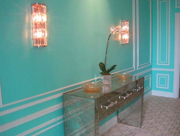
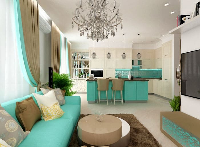
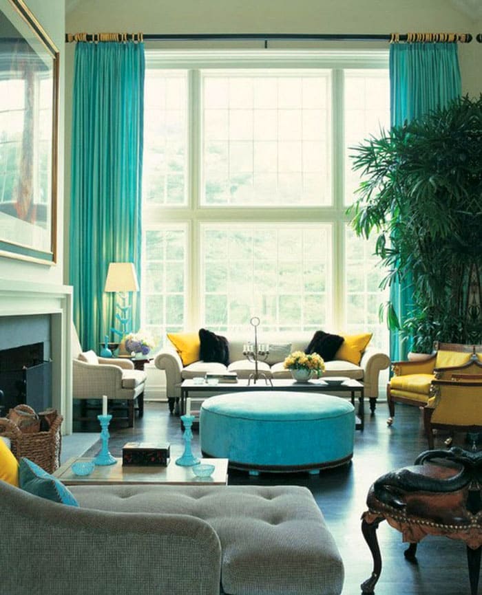
Here the color scheme is arranged in such a way that tiffany is the main one. But now other colors, which will dilute the main tone, will set the general atmosphere. In general, we admire and notice the subtleties of the design idea.
- PHOTO: dizainvfoto.ru
- PHOTO: homester.com.ua
- PHOTO: m.yandex.ru
- PHOTO: m.yandex.ru
- PHOTO: weareart.ru
- PHOTO: happymodern.ru
Bedroom and nursery
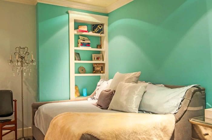
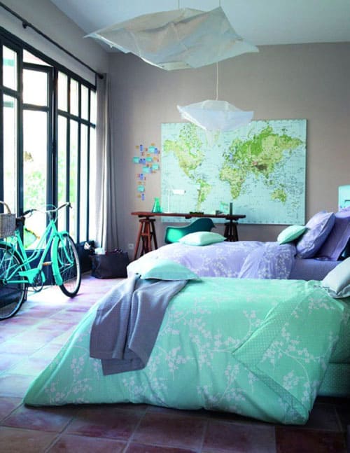
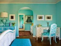
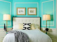
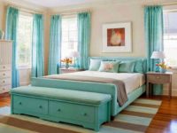
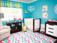
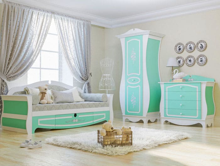
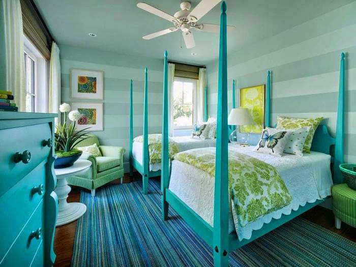
The bedroom does not require bright accents or flashy tones, therefore pastel colors can always become a companion of the main tone. You can also use a light coffee scale, shades of green. Linens also should not look disharmonious.
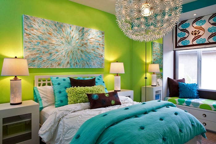
For a nursery, you can take either muted tones, or, conversely, saturated ones.
- PHOTO: design-homes.ru
- PHOTO: dizainvfoto.ru
- PHOTO: archidea.com.ua
- PHOTO: m.yandex.ru
- PHOTO: folksland.net
- PHOTO: design-homes.ru
- PHOTO: yandex.uz
- PHOTO: president-mobility.ru
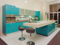
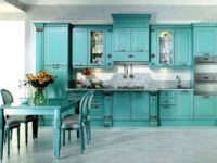
Kitchen and bathroom
Kitchen and bathroom - premises with their own requirements for the quality and characteristics of finishing and furniture.
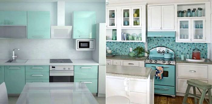
If the room is small, the color is not overused, leaving only islands of accents in the form of accessories. But, the impression will not be complete if you do not take care that each cup is in harmony with the tone of the interior.
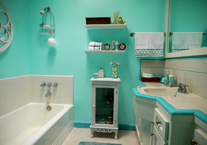
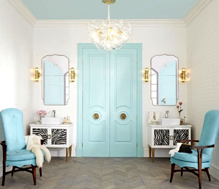
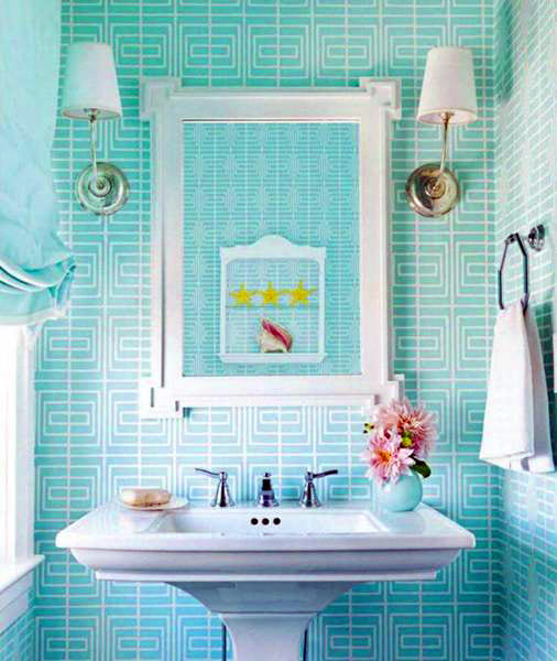
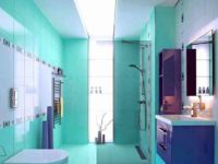
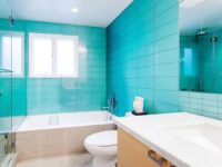
Bathroom It will surprise you that the color of the walls slightly changes its shade under different lighting parameters. Tile it is better to choose a different tone. In this case, it will not merge and spoil the effect.
- PHOTO: dizainvfoto.ru
- PHOTO: yandex.kz
- PHOTO: dizainvfoto.ru
- PHOTO: yandex.kz
- PHOTO: dizajninfo.ru
- PHOTO: pinterest.dk
- PHOTO: santa-keramika.ru
- PHOTO: archidea.com.ua
Tiffany color in furniture and textiles: set the accents
Furniture of this color refreshes and softens the perception at the same time. The decor will beautifully emphasize the rest of the room, but the right color companion should be chosen.
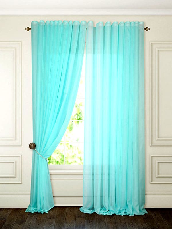
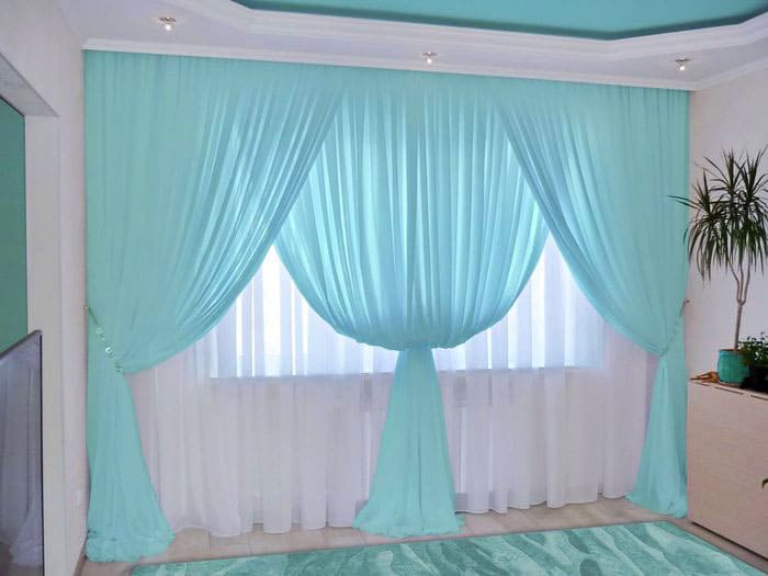
Textiles in the form pillows, covered, curtains tiffany's design always gives a feeling of spring and some kind of freshness. Textiles are well complemented by lamps, paintings, indoor plants.
Remember that we create comfort!


